Posts

Concept of Chart Patterns

Concept of Chart Patterns - The market values continuously keep changing.   This change is due to some news, events or behavior/ sentiments of the traders which results in forming definite shapes or patterns of the Candle Stick. These patterns can be of various types & can be bullish or bearish in nature. Trades can be planned based on the knowledge and confirmations given by the patterns formed. Examples of patterns - Hammer, Shooting Star, Head-Shoulder, Double Top, Double Bottom, Cup-Handle, Pennant/Flags, Triangles, Rectangles, Wedges , etc. We can get better understanding of the market movements if we thoroughly know the pattern types , psychology behind the patterns and the pre-requisites for their formations which will be covered in designated blogs.

Idea of Rally

Image
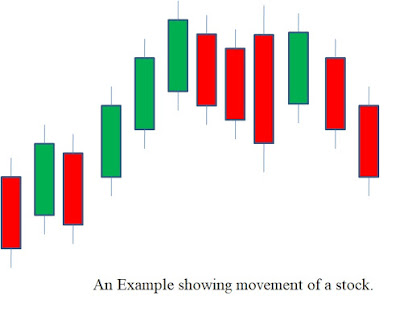
  Rally in Market- An asset value is affected by many factors. These factors include Earnings/Dividends declared, Change in Government policies, News, etc. Such factors combined together make the asset value move up or down.   There are situations when an asset continues to move in one direction which can be upward or downward. Such one sided movement is called Rally .   Examples- Upside Rally- When the asset price/candles continuously move upward. Downside Rally- When the asset price /candles continuously move down.

Idea of Breakout & Breakdown

Image
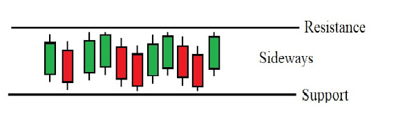
Breakout & Breakdown- An asset/share will move randomly or in manners forming definite shapes ( patterns ) or it will consolidate (trapped and move) in between Resistance and Support. When the asset breaks the Resistance line and moves upward, it’s said to have a Breakout(moves up). In the same manner, when the asset breaks the Support line and moves downward, it’s said to have a Breakdown(drops down) . Examples- In the examples above, it is seen that the candles on crossing the resistance line will give Breakout and when the candles cross the Support Line, it gives  Breakdown.                Note-This Breakout/Breakdown only works in combination with other various factors and proper knowledge which helps to take trades efficiently.

SUPPORT AND RESISTANCE

Image
  SUPPORT and RESISTANCE- A share value/price will continuously keep changing i.e., by going up and down. While moving up and down there will be values/range of price between which the stock moves and find it difficult to break the range. Resistance is the upper value/price beyond which it is difficult to move any higher for the stock. Support is the lower value/price beyond which it is difficult to go any further down for the stock.   For example- In the above figure, we see that the price/candles reached Resistance and Support areas and could not move any further up or down. In the context of charting, we can also say that if we find out the Resistance/Support then we can have an idea about the price movements.   Key points about drawing Resistance/Support - a) Candle Open/Close or Wicks can be joined (minimum 02 points) with each other to find Resistance/Support. b) A Resistance/Support line can be straight or inclined. c) We see a group of candle...

CONCEPT OF CHARTS

Image
  CONCEPT OF CHARTS For making any inferences about a stock over a period of time, we need to know its present value and the way the stock price/value has fluctuated during the period combined with various other factors. For this purpose, we use charts provided by charting platforms/sites which reflects the changes in a stock price/value as per our preferences. Most importantly, charts give ideas about the levels/prices between which a stock is consolidating (sideways movements) and the upper/lower values beyond which the stock is struggling to move out (Resistance/Support). There are many charting platforms available for free which we can use for viewing stock charts. The charting platforms mostly used by me are TradingView and Investing. Both the platforms have hundreds of useful tools. We can directly search the name of the platform we want to see and browse through them. Platforms link and Interface Screenshots- TradingView Investi ng Here we can explore and apply each tool...

Understanding price movements of a share

Image
  Movements of a share/stock When the market opens, any share/stock will have a opening value for the day. This value will fluctuate during the market hours i.e., candles/graphs, etc. will be shown for the up/down/sideways movements of the price. We see a green (bullish) candle when the price moves up and a red (bearish) candle when the price moves below in comparison to the previous candle. The color of the candles depends on the closing (Close) value of the candles and it decides whether a candle is bullish (green) or bearish (red). Up Movements - the price increases Down movements - the price decreases Sideways movements - the price neither increases nor decreases. The price keeps moving in a range. Examples- In the examples above, we can see that each red candle means the price of the share went down and the green candle indicates that the price has gone up when compared to the previous candle. If we set the time frame to 1 hour then each candle will show the changes in va...

Bullish and Bearish Candle Concepts

Image
 The price of any share continuously goes up and down during the market hours. While moving up and down the price will reach a maximum value (High) and will also go down to a minimum value (Low) . When the market opens the price of a share will also have a starting value (Open) and when the market Closes, the price of the share will also stop moving and will have a fixed value (Close) . High - Highest Value     Open - Opening Value     Close - Closing Value     Low - Lowest Value BULLISH CANDLE - It indicates that the price of the stock/instrument has gone up. It is generally green in color. BEARISH CANDLE - It indicates that the price of the stock/instrument has gone down. It is generally red in color.